Sunday, 30 November 2014

Production Update

See last post: 'Shooting Schedule' - Jimmy is introduced to Blake.

I was originally going to complete these scenes on Friday however due revision after school and commitments later on I was unable to do both therefore I decided to do the scene where Jimmy is introduced to Blake (highlighted). This was because the other scene involves outside and by the time we were ready to shoot it was very dark outside. The other scene will be completed next Sunday (7th December) as this will be the next time I will see Michael as he lives in Accrington.

This scene was done in my sister’s bedroom as she has a corner and a flat wall connected which was what I needed to show Jimmy (Oliver) curled up in a ball and Blake’s (Michael) shadow.

There were many problems that I had to overcome when doing this scene. 

Problem
How I resolved this problem
The lighting – I began by using a torch light but no matter where I positioned it the light was big enough to fit the shadow in (see picture 2)
I repeatedly moved the torch around the room to see whether I could position it right but I was unsuccessful. I then decided to use an iPhone torch as this lighting was much brighter and reflected much more therefore I could Oliver’s small shadow and Michaels shadow was clearly shown.

The camera (1) – I began by using the camera I have used for every scene so far but due to the lighting the camera would not focus and therefore not take the picture. When I researched whether I could overcome this problem I found that the camera has to have an object to clearly focus on when the flash is not in use and due to faded shadows there was nothing that the camera could focus on.

To overcome this problem I attempted to use ‘manual focus’ but due to little experience I could not get the image to be clear and of a good quality therefore I used a different camera (see problem 3).
(see picture 3)

The camera (2) – another problem I faced with the same camera I used for every other scene was that I could not fir the whole setting and shadows into the image.
I began by trying to change the auto to ‘landscape’ to see whether that would make a difference but that meant I had to have the flash on. When the flash was on it would show all the setting and not the shadows. (see picture 1)

I then decided to change the camera to a digital one (Panasonic Lumix DMC-FS30). This camera enabled me to turn the flash off and also fit in the aspects of the scene I wanted to.

Picture 1:


Picture 2:


Picture 3:


Below are some of the images taken from the digital camera:


In these images you can see Michael’s forearm and the part of the door therefore I will have to cope the chosen image sot that this isn’t shown.

Shooting Schedule

Friday 28th November

Maggie meets Blake and is introduced Jimmy


Wednesday, 26 November 2014

Production Update

At 14:50 to 15:05 today I managed to take pictures from two of my scenes. These scenes were when the audience first sees Jimmy and Sadie’s relationship and when Jimmy is being bullied by Jerome and Burdine. I believe this shoot when extremely well.

To begin with I had to choose where I wanted these scenes to take place and I, with help from my actors, decided to use the sixth form common room as there was a lot of space as well as the fact that no other students were in there therefore we could all concentrate on the task ahead and getting these scenes completely finished and ready to edit.  

I started by taking pictures of the scene where Jimmy is getting bullied by Jerome and Burdine. My initial idea was to have Jerome (George) and Burdine (Holly) walk past Jimmy (Oliver) and whilst walking past him Jerome would push Jimmy so that his folders and books fell out of his arms however I decided to still do this but add on a sequence where Jerome slams Jimmy up against the school cabinets before walking away. This was because it was not clear that Jerome is pushing the folders out of Jimmy’s arms and from this new idea it is extremely clear that Jimmy is being bullied.

Following on from this, I did originally suffer with one problem which was my timing of taking the pictures. When Jimmy drops his folders I unfortunately could not time myself correctly to see the folders mid-air. To resolve this problem I changed my camera settings to ‘sports’ which takes a number of pictures which just one click, this meant that I had the whole action and now means I have a range of pictures to choose from.  

Below is an example shot:

Although in this picture the actors are blurry I think that it works well as it looks as though Jerome is using his full force and shows he doesn’t care for Jimmy. It also shows the high action of the scene.

Furthermore, I also took pictures of Burdine and Jerome laughing as they walk away from Jimmy, this shows their lack of sympathy for him which is good because it clearly shows the audience their personalities.

When starting the other scene I had a minor problem with the lighting as it was either too light that the actors looked very pale or it was too dark that they looked orange and the image was very dull. To resolve this problem I messed around with the common room lights and also my camera settings. Luckily, I had a fellow student who knew how to work the camera I was using. For this shoot I used the ‘full auto’ image so that the lighting and image looked natural. 

I took the pictures from a variety of angles, for example:
  • From the side
  • A long shot from the front
  • A mid shot from the front
  • A close up for a low angle to show Jimmy’s passion for Burdine

I am very happy with the pictures I got today and will now continue editing my final piece.

Monday, 24 November 2014

Production Update

Today I was planning to take images of two scenes (Jimmy and Sadie and Jimmy, Burdine and Jerome). However, this unfortunately did not take place as Amber, who is playing Sadie, was off school with an illness and George, who is playing Jerome, had to go home due to family issues.

Due to these circumstances we have all decided to complete this task on Wednesday afternoon when we all have a free period (14:05 – 15:05). 

Considering the Music

Over the past few days I have been focusing on what music I would like to have as the non-diegetic sound. In Year 12 I used www.freeplaymusic.com to find the soundtrack for my opening title sequence and due to the experience I have of this website I have decided to use this website again.

When considering my music I am hoping to use two different soundtracks in order for the music to reflect the mood of the opening title sequence. For example in scenes where Jimmy is feeling low (visiting his biological father’s grave) I want the music to be very slow and touching so the audience gathers sympathy and hurt for Jimmy. Furthermore when Jimmy finally decides to leave and move away I want the music to be much more upbeat and quicker to reflect the beginning or a new, unknown adventure.

My Findings:
To begin with I created an account in order for me to access the different soundtracks available on the freeplaymusic website. I then typed ‘sadness’ into the search bar and listened to all the different soundtracks available on the 8 page result. Below are the tracks I liked and why.

For the scenes where Jimmy is feeling low/ worthless:

Page Number
The Soundtrack
Why did I like this soundtrack?
1
Serious Elevation
To begin with there is a range of tones used therefore it is nice and easy to listen to. By having the slow and acoustic guitar it reflects that Jimmy misses his father but when the more upbeat track is played it reflects that he is thinking about the good memories they had together.
1
Subtle Defeat
Throughout this soundtrack it is the same rhythm which follows the conventions of opening title sequence music. Furthermore, at the end it drifts out slowly which would be beneficial to me as it would make it easier for me to introduce the next soundtrack (ensures continuity of the music).
3
Essential Longing
This soundtrack reminds me of a Westlife song about losing someone special which obviously reflects the sad times Jimmy is going through at the moment.
3
Discover Tranquillity
This soundtrack stood out to me as I like the way the volume continuously increases then decreases. I thought this would go well throughout the scene when Jimmy is visiting his biological father’s grave.

As I am considering using two different soundtracks that are completely different I have decided that I need to also look for another soundtrack that fits in between the slow/ touching soundtrack and the upbeat/ quicker soundtrack. For this I searched for ‘adventurous’ music. After listening to a range of soundtracks there was one that specifically stood out to me named ‘Gray Knight’. I thought this was the best suited as the tone reflects Jimmy’s determination and unknowingness of what is ahead for him as he ventures on.

As I had found a number of soundtracks I liked I then moved on to searching for music that would be appropriate for the scenes where Jimmy’s life is much better after his decision to move away and leave his family behind. Unfortunately I have not yet found a soundtrack that I like and think would be suited for my opening title sequence. However, this search did not go to waste as I found a soundtrack called ‘The moment I knew’ (page 6) by an unknown artist, Jessica Labus. This track runs for around 4 minutes 58 seconds. After 15 seconds of the track playing lyrics suddenly appear saying “you were bold, you were different”.

As soon as I heard the lyrics I thought this soundtrack would be perfect for the scene where Jimmy meets Sadie as their relationship is extremely caring and loving. Throughout this soundtrack Jessica sings about meeting someone who she grew attached to and ended up falling in love with, this highly reflects Jimmy and Sadie’s relationship. I will hope to use the following lyrics “you were brilliant and you listened to me.” Additionally, I like the music without the lyrics also therefore I am considering whether to use the soundtrack without the lyrics throughout the scenes where Jimmy is attending his new school as the soundtrack is very calming and relaxing which reflects the way Jimmy is feeling with his new life. The lyrics will then begin when the scene of Jimmy and Sadie appears.

The final music choices will be decided when I have collected all of my images from all scenes. 

Sunday, 23 November 2014

Shooting Schedule

Monday 24th November

Jimmy meets Sadie


Jimmy meets Jerome and Burdine


To the build-up of this scene I have been thinking about any problems that could be raised. One main problem is that when Jerome is seen in motion picture individually he will be either holding a cigarette or smoking one. This idea was due to my target audience saying they associating smoking and drugs with thuggish characters. The problem with is that my target audience is between the ages of 12 and 16 so I have to ensure that my title sequence does not look as though it is promoting the bad habit of smoking. To resolve this problem I have decided that due this filming of Jerome I will have Burdine come onto the camera and flick the cigarette out of his hand with a frown on her face. This will look as though it is a bad habit and should not be done. They will then do their motion picture together instead of individually.

Wednesday, 19 November 2014

Production Update

I have previously stated that I will continue with my production on Thursday 20th November but due to George having an unfortunate driving lesson we are unable to film after school on this day. I then considered filming later on in the evening but the sunset is much earlier recently which will make the pictures look dark and of a poor quality. Furthermore, if the lighting is dark the opening title sequence will look unnatural as there will be a quick change in lighting between the two scenes hammocking this scene.

Following this as a group (me, George, Holly, Amber and Oliver) we have decided to complete this scene on Sunday 23rd November after Oliver’s lacrosse match. Times are still to be confirmed. 

Tuesday, 18 November 2014

Ancillary Task: My Editing Schedule

I  have decided to use Microsoft Publisher to complete my ancillary tasks as I believe this was the best programme available to me and I have years of experience using it. I began by choosing my background colour. My initial idea was to have a simple solid background using just one colour but I then decided to use two colours as a ‘gradient background’. The two colours I am using are grey and a neutral colour as my target audience is both males and females therefore the colour palette cannot be bias to one gender, for example using blue.


My next step was to edit the title by using ‘set transparent colour’ otherwise the title would have had a white box around it and made the front cover look poor. This setting allowed me to blend the title in with the background. However, there was a problem. The footprints I had originally decided to use did not set transparently (as seen below) therefore there were small white markings around the image which made the title and front cover look less creative.


To resolve this problem I had to go back to researching different images of footprints that did not create the same problem. Below is my new title.


My next step was to create a suitable critic and collect images of the Production Company logos and BBFC rating. In terms of the critic rating I researched other DVD front covers and found that ‘The Sun’ newspaper are the most popular source to comment on films/ TV programmes therefore I also decided to use them as my critic.

I then researched to find information on BBDC ratings. From my research I decided to rate my programme as ‘PG’ (parental guidance is advised) as some scenes throughout the programme may be upsetting for some viewers, for example Jimmy visiting his biological father’s grave.
Finally, I collected two images (one of the BBC logo and one of the CBBC logo). This will give the audience an insight into the Production Company and as the BBC and CBBC are very well known and popular therefore this will be my unique selling point and may make my programme more popular due to the success of the BBC and CBBC.


As I was editing my DVD front cover I thought of another idea that I thought would look good. This was to have the picture of Oliver (Jimmy) cropped so only half of his face (right side)  was showing and have the title underneath this so that the footprints about the ‘i’ in Jimmy connect with his eye. This will symbolise jimmy has had a rough childhood and represent him as being weak and frail. Additionally, Oliver (Jimmy) has a slight smile on his face which can symbolise that he is a fighter and his life does get better.

I have made good progress over the course of editing my DVD front cover. My final task will be to film the last few scenes and fill the film reels with images from these scenes, my first ancillary task will then be complete.

Shooting Schedule

Thursday 20th November

As George, who is playing Jerome, has been moving house I was unable to film this scene until now.

Jimmy meets Jerome and Burdine


To the build-up of this scene I have been thinking about any problems that could be raised. One main problem is that when Jerome is seen in motion picture individually he will be either holding a cigarette or smoking one. This idea was due to my target audience saying they associating smoking and drugs with thuggish characters. The problem with is that my target audience is between the ages of 12 and 16 so I have to ensure that my title sequence does not look as though it is promoting the bad habit of smoking. To resolve this problem I have decided that due this filming of Jerome I will have Burdine come onto the camera and flick the cigarette out of his hand with a frown on her face. This will look as though it is a bad habit and should not be done. They will then do their motion picture together instead of individually.

Ancillary Task: DVD front cover design

Today I began by looking at my previous research on conventions of a DAD cover and based my research on my findings. I researched the following:
  • A ‘PG’ BBFC sign as it does contain some upsetting scenes (when Jimmy is being bullied)
  • BBC and CBBC logos (Production Company)
  • Created a critic from The Sun newspaper
Below are a few images I will include on the front cover:


In terms of the film reels they are not yet complete as I have not finished taking pictures of all scenes therefore this will be a working progress until I have completed the scenes. There will be a total of 3 film reels, 1 containing 4 images, 1 containing 3 images and the final one containing 1 image.

Production Update

Today I decided to take the picture of Jimmy (Oliver) for my DVD cover. I wanted this picture to be a close up on his face so that my target audience will quickly and easily be able to recognise that the programme is ‘Jimmy’s Journey’ as it has the main character on the font cover which stands out.

Below are a few pictures I took:


This now means I can begin to put my DVD front cover together and complete my first ancillary task.

Monday, 17 November 2014

Draft 1: DVD Cover

Below are pictures of my first drawn draft of how I want my DVD cover for the programme to look.


The close up picture of Jimmy (Oliver) will be taken on Tuesday 18th November therefore I hope to have completed one of my ancillary tasks by the end of this week. 

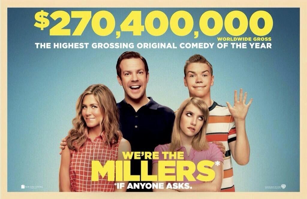
Ancillary Task: Poster Analysis (2)

Is it a successful marketing tool?
Box Office
Total lifetime gross
Domestic: $150,394,119
Foreign: $119,600,000
Worldwide: $269,994,119 (£164,927,230)

Budget: $37 million

How successful was this film?
Number 1 key European markets such as Germany and breaking records in Russia, where it had become the highest grossing R-rated comedy of all time.

Film (produced by Warner Bros)
Domestic Gross
Worldwide Gross
We’re the Millers
$150,394,119
$269,994,119
The Call
$51,872,378
$68,572,378
The Great Gatsby
$144,840,419

The Conjuring
$137,400,141


This table shows just how successful ‘We’re the Millers’ is. I browsed the Warner Bros website and found a page based on all the films they have produced (https://www.warnerbros.co.uk/movies/explore). I decided to choose a few well known and great films and compare their box office to We’re the Millers.

Although it did not beat ‘The Great Gatsby’ and ‘The Conjuring’ on the worldwide box office it was fortunate to top both of their domestic box office totals (in the country the film was produced in).


My own beliefs
Overall I think the poster is a good marketing tool and is very successful. This is because it follows the conventions of a film poster, as discussed in previous posts. For example it is very eye-catching and captivating through the use of the colour palette. The colours used are very bright colour suggesting this film is humorous and light hearted. Furthermore, by showing the whole family it also suggests that it is suitable for a family comedy. The use of the slogan “*IF ANOYONE ASKS” informs the audience that there is a little mystery to the film and also it makes the poster stand out from the rest as it is written in white which is opposite to the title. Finally, the use of information on the actors, Production Company and ratings/ reviews makes the audience’s expectations increase making them want to see just how successful the film actually turns out to be.

Ancillary Task: Poster Analysis (1)

To help me design my first draft I decided to analysis ‘We are the Millers’ DVD font cover as this is aimed at teenagers, like my programme.


Ancillary Task: Convention Research

I will continue with my production on Thursday 20th November but for the time being I have decided to focus on my two ancillary tasks.

Conventions of a film poster
  • It has to be eye catching and captivating to the audience
  • Generally there is a focal image that will catch the audience’s attention
  • The title is displayed in a large, eye-catching font
  • Clearly defined the film’s genre
  • Should be designed to attract the largest audience possible
  • Usually an indication of when the films is going to be released (e.g. a date or ‘Coming Soon’)
  • Information on the directors and production company, this is usually presented at the bottom of the poster
  • There can be reviews/ ratings from critics or there can be titles of other films the production company has also made

Conventions of a magazine front cover
The main function of a magazine front cover is to sell the whole magazine
è  They are the first thing the audience will see therefore it has to be eye-catching, interesting and brightly coloured in order for it to stand out
è  It has to be appropriate for the targeted audience

The masthead
Usually at the top of the page (this can be either a logo/ header that will be instantly recognisable to the audience)
Slogan
Many magazines use slogans – usually placed under the header to explain the magazines content or to make it stand out from their rivals
Fonts
They tend to use a variety of fonts – this is usually to make it interesting. However, some magazines use the same font throughout the magazine
è  For example: Q magazine 
Tag lines
This is the main text on the cover – they advertise the articles the magazine contain to entice the readers
The main image
Model/ star
Photographed in a close up (usually a head and shoulder shot) or medium shot
Music stars/ band
Generally photographed in a studio and establishing shot to show all group members

This main image can give the audience a basic idea of what content is included within the magazine. For example: the image below looks as though she is gazing at the reader and is giving a very persuasive look, this can be seen as being non-verbal communication. This will instantly draw the audience in.
The use of the model/ star(s) looking directly into the camera is very common however some magazines do break this rule. 

Colour palette
This generally makes the magazine recognisable to the audience

Many magazines will include the price in a larger text or sometimes include a free gift to lure the audience in.

Date/ barcode
This is usually alongside a web address to the magazine’s official website
The articles cover line
Always bigger than the rest of the text and dominates the page

Conventions of a DVD front cover
  • Some feature a quote from a critic, for example ‘The Sun’ and usually these critics are praising the film. This makes the audiences expectations increase and want to see the film more than what they possibly already wanted to
  • All DVD’s feature a blurb at the back, this is to inform the audience about the general storyline
  • Some feature a ‘special features’ box at the back to let the audience know what else the DVD has to offer/ includes
  • All conventional DVD covers include a barcode, credits, the certificate and any additional details the producers may want to include (for example the running time)
  • All DVD covers have the films production company and financial partners